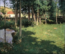
Klimt was a master of composing in a square format. He probably favoured the square because it tends to bring out the abstract or architectural qualities of a scene. Though the shapes in this L-shaped composition are quite minimalist, he fills them with interesting textures, applied randomly, but the eye is tricked into seeing fine, realistic detail.
Saturday, August 14, 2010
L-shaped composition
Klimt was a master of composing in a square format. He probably favoured the square because it tends to bring out the abstract or architectural qualities of a scene. Though the shapes in this L-shaped composition are quite minimalist, he fills them with interesting textures, applied randomly, but the eye is tricked into seeing fine, realistic detail.
Chiaroscuro
The Australian painter John Anderson makes use of chiaroscuro - strong contrasts between light and dark - to give his images power. This landcape is rather like a charcoal study, and indeed chiaroscuro originated during the Renaissance as drawing on toned paper, where the artist worked from this base mid tone towards light, with white gouache, and towards dark, with ink, bodycolour or watercolour. Chiraoscuro can suggest a dream-like world in which images emerge from the dark background of the subconscious.
Saturday, July 31, 2010
Tuesday, July 20, 2010
Saturday, June 5, 2010
Bierstadt
Cathedral Rocks
This German American painter is one of my favourites. His subjects are often dramatic and sublime.
Friday, May 28, 2010
Josef Willroider - German 1838-1915
17 x 32 cm
The brushwork in this little piece (stumbled upon on an art auction website) is wonderfully eloquent and efficient (how German). Right-leaning diagonal marks in the sky balance the left-leaning reeds.
Tuesday, May 25, 2010
Complementary Colours
George Carlson, American, In the Shadow of the Sun, 42 x 42 inches
Subtle hints of pink lend radiance to the predominantly green palette. There's just the right amount of the complementary colour to create a vibration. Too much and the vibration becomes oscillation, and the sense of peace in the work is lost. The square format enhances the abstract qualities of the piece.
Here's a link to the artist's biography.
Subtle hints of pink lend radiance to the predominantly green palette. There's just the right amount of the complementary colour to create a vibration. Too much and the vibration becomes oscillation, and the sense of peace in the work is lost. The square format enhances the abstract qualities of the piece.
Here's a link to the artist's biography.
Subscribe to:
Posts (Atom)