Showing posts with label colour. Show all posts
Showing posts with label colour. Show all posts
Monday, May 21, 2012
Summer
Claustro de Georges Sands
Garden of Sa Coma, Valdemosa
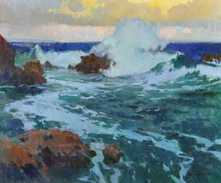
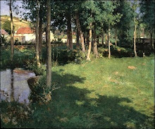
In these two landscapes the Spanish (Catalan) painter Santiago Rusinol (February 25, 1861 - 1931) uses daringly bright greens to evoke the intense light of the mediterranean summer.
Rusinol was particularly fond of painting gardens, and was a supporter of modernism, who influenced Picasso.
Tuesday, May 8, 2012
Philip Wolfhagen
Third Exaltation
The study of clouds was my first interest within the genre of landscape painting and every few years I return to the subject with renewed enthusiasm. Often I am driven by dissatisfaction with my earlier efforts, always striving for a more refined palette and a lighter touch.
The study of clouds was my first interest within the genre of landscape painting and every few years I return to the subject with renewed enthusiasm. Often I am driven by dissatisfaction with my earlier efforts, always striving for a more refined palette and a lighter touch.
Third exaltation is one of a series of five large cloud paintings from 2011. In this painting I have worked over a pale citrus yellow ground, concentrating on paring back tonality to its bare minimum and allowing colour temperature to define pictorial depth.
- Philip Wolfhagen, 2012
This large scale work (I think it's about 3 x 3 m) was a finalist in the Wynne Prize this year, perhaps the most prestigious landscape prize in Australia.
Using a warm orange or yellow ground lends vibrancy to the blues and greys in skies.
Saturday, November 19, 2011
Fields
Charles Courtney Curran, American, A Breezy Day, 1887
Joaquin Sorolla y Bastida, Spanish, Prado de Asturias (Field in Asturias) 1903.
The simplicity of these two works is very attractive: just green and white with a hint of pink to complement.
A few years ago I bought a tube of cinnabar green light by Rembrandt. It's the best colour I have found for sunlit grass. The grass in the lower painting must have been painted with cinnabar or something close to it.
Rembrandt Cinnabar Green Light
Friday, December 10, 2010
Color Loudness
Bright colors are popular with many art buyers, and many painters, realising this, tend to indiscriminately exaggerate color regardless of the subject and lighting conditions and mood. The result is that their work can seem unconvincing. (which is not to say that photographic accuracy should be the aim). The loudness is stimulating initially, but soon becomes tiring.
However, the intense colours in these beautiful landscapes, by the American artist Mark Kerckhoff, are appropriate, as his subjects here are arid badlands where the light is intense.
Vibrancy of color is not achieved by simply turning up the 'volume' of color, but by an understanding of complementarities.
Sizes:
Top: 20 x 24 inches
Bottom: 12 x 16 inches.
Sizes:
Top: 20 x 24 inches
Bottom: 12 x 16 inches.
Saturday, July 31, 2010
Tuesday, May 25, 2010
Complementary Colours
George Carlson, American, In the Shadow of the Sun, 42 x 42 inches
Subtle hints of pink lend radiance to the predominantly green palette. There's just the right amount of the complementary colour to create a vibration. Too much and the vibration becomes oscillation, and the sense of peace in the work is lost. The square format enhances the abstract qualities of the piece.
Here's a link to the artist's biography.
Thursday, December 31, 2009
Henri Rousseau
Tiger in a Tropical Storm. Surprised!
This is one of my favourite works of Rousseau. He achieves a good balance between warm and cool colours, and the energy of the storm is wonderfully expressed. The variety of green shades look vibrant but natural (in this reproduction at least). As in Eastern painting, this work has a near total absence of shading and atmospheric perspective (desaturation of colours with distance), techniques used to create the illusion of three dimensions. The result is a unified flat design, almost like a textile, in which colour and line are celebrated.
This is one of my favourite works of Rousseau. He achieves a good balance between warm and cool colours, and the energy of the storm is wonderfully expressed. The variety of green shades look vibrant but natural (in this reproduction at least). As in Eastern painting, this work has a near total absence of shading and atmospheric perspective (desaturation of colours with distance), techniques used to create the illusion of three dimensions. The result is a unified flat design, almost like a textile, in which colour and line are celebrated.
Saturday, December 12, 2009
Thursday, October 1, 2009
Daniel Pinkham - American


Use of square format gives a contemporary feel, and suits the abstract qualities in these works by the West Coast American painter Daniel Pinkham.
Monday, August 24, 2009
John Glover

Sun Rise, Shropshire
The English painter John Glover is well known in Australia as one of the first Europeans to depict the Australian landscape. The pink in the clouds makes the neutral hues in the trees appear a very subtle green. Without the pink, this landscape would be a lifeless sepia. If the green hues were brighter they would detract from the delicacy of the evening sky. Colour, used in this contextual way, is magical.
Sunday, August 2, 2009
Peter Simpson - Australian


It's often said that artists and galleries avoid green paintings. It's difficult to mix convincing greens. But I love the green in these pieces.
Sunday, June 28, 2009
Camilla Connolly - Australian

Cape York - Wall Drawing and Table, 62 x 102 cm
The warm colours, and combination of interior and landscape, are reminiscent of Bonnard.
Sunday, May 17, 2009
John F Carlson - American 1874-1947

February Gaiety, 25 x 30 inches
Colour must be added with great sensitivity to a work that is basically a monochrome image of whites, greys and blacks. A strong colour would be deafening in such a still scene.
Thursday, April 30, 2009
Jacopo Bassano (da Ponte)
+Pastoral+Landscape+c.+1560+139x129cm.bmp)
Pastoral Landscape, c. 1560, 139 x 129 cm
Museo Thyssen, Madrid.
White acts as a unifying element in this composition.
White acts as a unifying element in this composition.
Monday, March 9, 2009
Arthur Wesley Dow - American
Thursday, November 6, 2008
Konstantin Yuon - Russian

Blue Bush, 71 x 107 cm
A painting which celebrates a particular colour and introduces a small amount of its opposite colour.
A painting which celebrates a particular colour and introduces a small amount of its opposite colour.
Monday, April 14, 2008
Sea Rocks
To balance the cool colours in the seawater, marine artists often add pink reflections of a sunset, or sunrise. Reddish brown rocks also add contrast. To make a pleasing composition, where there is an area of rocks, or headland, to one side of a painting, a smaller area of rock, or headland, should be added as a counterbalance on the other side. In the painting with the figure, the hair of the woman counterbalances the rocks to some extent.

Frank H. Myers - The Golden Path,
24 x 30 inches, 1940's

USA, 30 x 46 Inches
.+Watercolour+And+Gouache.jpg)
Evening On The Beach.
Dame Laura Knight, R.A. (1877-1970).
Watercolour And Gouache
Thoughts about Painting
Sometimes it's good to start a painting with a colour that is deliberately 'wrong', in the sense that it doesn't match 'reality'. Think of the evocative gold backgrounds in icons or Japanese screens, or the mysterious black backgrounds in European Portrait painting. This forces you to think of the painting as a self-sufficient design with it's own internal laws, not as a slavish reproduction of nature.
Sunday, February 17, 2008
Monday, January 21, 2008
Subscribe to:
Posts (Atom)


.jpg)


+1900.bmp)