
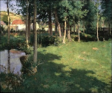
Subtle hints of pink lend radiance to the predominantly green palette. There's just the right amount of the complementary colour to create a vibration. Too much and the vibration becomes oscillation, and the sense of peace in the work is lost. The square format enhances the abstract qualities of the piece.
Here's a link to the artist's biography.


.jpg)


+1900.bmp)
No comments:
Post a Comment