Date: Sunday August the 10th, 10 am until around 5pm. Balmoral country property.
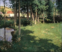
We all painted the same scene (from a copies of a photograph), watching the teacher step by step, and learned to achieve atmospheric effects through colour and tone with a limited pallet. $40/student for a full day indoor workshop, which was very reasonable. Working indoors was good because we could concentrate on the techniques of the step by step lesson, and not get distracted by the vastness of nature and changing light/weather etc.
Steve emphasised getting correct tonal values and colour temperatures to create the illusion of depth. It was very helpful the way he put a dab of the paint he had mixed on our palettes, so we could try to match it.
We did the underpainting of the receding hills with French Ultramarine mixed with a little Alizarin Crimson, and progressively added white (and crimson?) as things got more distant. The foreground underpainting was quite dark. We did the reflections in the water at the same time.
Sky - just French Ultra and white, graduating whiter towards the horizon - leaving the white primer showing where clouds would be painted (this meant that there was no need to wait for the blue to dry, and no need to add many layers of white paint to cover the blue and get the clouds looking white enough. Where the sky meets the horizon, we blurred the hard edge a bit - particulary in the distance.
Clouds - it's important to keep the blue of the sky saturated enough so that you get enough contrast with the clouds. Avoid making the clouds too cottonwool-like - they can be painted quite roughly, with rough edges. We added a dot of yellow to warm up the white for the clouds, and added shadows of ultramarine with a dot of aliz crimson. White cloud painted next to dark cliffs enhanced tonal contrast.
Overpainting of vegetation. We mixed greens using cool yellow, ultramarine and white in the distance; progressing to viridian mixed with cad yellow, or cad orange, with less white in the foreground. A little yellow ochre for the closest areas. It's important that the underpainting be tacky/dry, not wet, when stippling the foliage over with a dry brush (no medium). We tried to leave some of the underpainting showing where there were shadows.
Materials:
10 x 8" board, prepared beforehand with two coats of gesso primer. Steve used oil painting paper (he doesn't bother to gesso it). He uses regular house paint to prime his boards. Flat brushes of various sizes and a very small round brush for final little details. He recommends pig bristle flats (not nylon) as they produce messier, more natural marks. I was using brights (short bristles); he advised using longer bristles to get more 'flick' in the brushstrokes - this was very helpful.
We used table easels. A box of tissues was handy to wipe the brushes. Steve recommended a fast-drying (number one) medium, as he likes to paint alla prima, and so we needed the underpainting to dry quickly.
The following oil paints (Steve recommended Windsor and Newton) were used:
Opaque White
Lemon (cool) yellow
Cadmium (warm) yellow light, Cad orange
Yellow ochre
Burnt Sienna
Cool red, eg alyzarin crimson, permanent rose
Cadmium red (warm red)
Veridian or pthalo green (more intense green for foreground)
French Ultramarine Blue
Cobalt Blue (I don't think we used this)
Note: these colours are for painting the Australian lanscape. Other regions probably require a different palette.


..jpg)


.bmp)


+1900.bmp)


+17x15+in.jpg)
+17x15+in.jpg)


.jpg)


