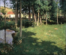
Storm in Harvest, 1856
source: art inconnu
Saturday, December 25, 2010
Friday, December 10, 2010
Color Loudness
Bright colors are popular with many art buyers, and many painters, realising this, tend to indiscriminately exaggerate color regardless of the subject and lighting conditions and mood. The result is that their work can seem unconvincing. (which is not to say that photographic accuracy should be the aim). The loudness is stimulating initially, but soon becomes tiring.
However, the intense colours in these beautiful landscapes, by the American artist Mark Kerckhoff, are appropriate, as his subjects here are arid badlands where the light is intense.
Vibrancy of color is not achieved by simply turning up the 'volume' of color, but by an understanding of complementarities.
Sizes:
Top: 20 x 24 inches
Bottom: 12 x 16 inches.
Sizes:
Top: 20 x 24 inches
Bottom: 12 x 16 inches.
Wednesday, November 24, 2010
Wednesday, November 17, 2010
James Perry Wilson
Wilson had a masterly control of tonal values.
His simple palette consisted of the primary colors: three blues, three yellows and three reds.
Permalba white
Ultramarine blue
Cobalt blue
Winsor blue
Cadmium yellow pale
Cadmium yellow deep
Yellow ochre
Alizarin crimson
Cadmium scarlet
Indian red
Source: www.peabody.yale.edu
His simple palette consisted of the primary colors: three blues, three yellows and three reds.
Permalba white
Ultramarine blue
Cobalt blue
Winsor blue
Cadmium yellow pale
Cadmium yellow deep
Yellow ochre
Alizarin crimson
Cadmium scarlet
Indian red
Burnt umber, cadmium pale green for highlighting leaves, and cadmium lemon were also used with less frequency.
He primed his supports with brilliant white oil paint that lent a brilliance to the colors layed over it. He used the Impressionist technique of optical mixing of colors but was careful to make them of the same tonal value. Wilson describes his method for painting a vibrant sky.
Set out three dabs of white (or four, if you want to use two blues). With one mix a tint of ruby madder, with one a tint of cadmium, and with the remaining one (or two) tints of blue. In working the color into the white, you can produce a graduated tint, covering the range of values you will want in your sky. Then from the deepest part of the tints you can mix a color for the top of the sky. As you come down, use successively lighter parts of the tints. An effective way of mixing the color from the three tints is not to use a knife, but to pick up a bit of each tint directly with your brush. Stir them together only lightly, so that they are not too thoroughly mixed. Then you will get a suggestion of broken color, in a free, loose way. In preparing the three (or four) tints, be careful to make the values correspond; for in broken color it is important to have your values the same; otherwise the colors will never flow together and produce vibration. This, to my mind, is the failing of the French Impressionist painter Seurat. He uses dots of color of varying values and they remain just dots of color, never uniting to the eye as Monet's do.
Source: www.peabody.yale.edu
Daniel Graves
Given that we do not want to just repeat the work of past centuries, I think one of the great challenges we face is that of discovering what we are going to paint and sculpt. To merely record the surface appearance of "reality"? has never been the province of painting, whose language is far deeper. From the beginning, artists have painted, sculpted, and drawn things that had meaning for them, and the images they have left behind are a living testament, a record of their consciousness on earth.
To continue the testimony of what humans have seen, believed, felt, and thought, we must have the courage to ask ourselves what we really care about, because if we do not know we cannot express it. We must develop our capacity for deep feeling, for what we know with our minds is only part of what we have to give to our art—we also have our hearts to give. Today many of us are adults in our minds but children in our hearts. We must grow wise in our hearts, in tandem with honing our craft, in order to express ourselves in a way that will both touch and be meaningful to others. To seek beauty and meaning in our lives is to bring it into our art.
-Daniel Graves
Tuesday, November 16, 2010
Radiating Lines
A nice plein air study.
The apparently quiet and simple subject forms a dynamic and interesting composition because of radiating lines, diagonal movements of the banks of the stream and the central mass of trees, pulling away from each other but also drawing the eye into the heart of the scene.
The small patches of light seen between the trees on the horizon are almost pure white, while the shadows reflected in the stream are almost pure black. This gives the painting the full range of tonal contrast.
Thursday, November 11, 2010
WC Piguenit
Kosciusko
William Charles Piguenit, 1836-1914, Australian.
Unassuming and retiring, he shrank from controversy and quietly resigned from the Art Society of New South Wales when it split over the impressionist movement. The first Australian-born artist of note, he delighted in mountain scenery and often chose dramatic subjects for his painting.
Mount Kosciusko is the highest point in Australia.
Read more about Piguenit on a very interesting blog I follow: Art and Architecture, Mainly
Mount Kosciusko is the highest point in Australia.
Read more about Piguenit on a very interesting blog I follow: Art and Architecture, Mainly
Subscribe to:
Posts (Atom)